The Basics of Color Psychology
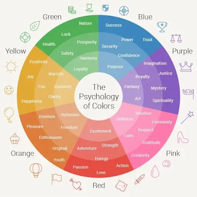
Before we dive into the specifics of UI design, let's get to know the basics of color psychology. Different colors evoke different emotions and perceptions. Here's a quick overview:
Red: Associated with passion, excitement, and urgency.
Blue: Evokes trust, serenity, and professionalism.
Yellow: Represents happiness, optimism, and attention-grabbing.
Green: Symbolizes growth, nature, and harmony.
Purple: Conveys luxury, creativity, and spirituality.
Orange: Radiates energy, enthusiasm, and playfulness.
The Role of Color in UI Design:
1. Branding:
Colors are integral to a brand's identity. They help users recognize and remember your product. Think of Facebook's signature blue or McDonald's vibrant red and yellow. These colors are not arbitrary; they're carefully chosen to align with their branding and convey specific emotions.
2. User Engagement:
The right color choices can lead to higher user engagement. For call-to-action buttons (CTAs), using contrasting colors that stand out can encourage users to take the desired action, such as signing up, making a purchase, or sharing content.
3. Readability and Accessibility:
Consider your audience's needs. Ensure that your text is easily readable by using high-contrast color combinations. Additionally, adhering to accessibility guidelines (such as WCAG) can make your UI design inclusive and user-friendly for all.
4. Cultural Considerations:
Colors can have different meanings across cultures. For instance, while white symbolizes purity and peace in Western cultures, it's associated with mourning in some Asian cultures. Be mindful of your target audience's cultural background when choosing colors.
5. Emotional Impact:
Understanding the emotional impact of colors is crucial. If your app or website is related to healthcare, soothing colors like blue and green can convey a sense of trust and calm. On the other hand, if you're designing a gaming app, vibrant and energetic colors like red and yellow might be more appropriate.
Case Studies:
Let's explore a couple of case studies to see how the psychology of color influences UI design:
1. Facebook:
Facebook uses a soothing blue color scheme, reflecting trust and dependability. This choice makes users feel safe when sharing personal information and engaging with the platform.
2. Spotify:
Spotify incorporates green and black, symbolizing growth and elegance. This combination conveys that users can expect a sophisticated, music-rich experience.
Practical Tips for Color Selection:
Start with a Mood Board: Collect color samples that resonate with the emotions and personality you want your brand to convey.
Test with Real Users: A/B testing can help determine which color schemes perform best with your target audience.
Use Color Harmonies: Utilize color harmonies like complementary, analogous, or triadic colors to create visually pleasing and balanced designs.
Consider Accessibility: Ensure that your color choices meet accessibility standards for those with visual impairments.
Conclusion:
The psychology of color in UI design is a powerful tool at your disposal. When harnessed effectively, it can shape user perception, drive engagement, and strengthen your brand identity. Remember, color is more than aesthetics; it's a language of emotion. So, next time you embark on a UI design project, think about the emotions you want to convey and choose your colors wisely. Your users will thank you for it.


Post a Comment