Startup, Entrepreneurship and Certification. You will also find the trending articles

October 2023

 Mastering the Art of Button Design in UI

Introduction

Buttons are the unsung heroes of User Interface (UI) design. These small elements play a significant role in the user experience and can make or break a design. In this blog post, we will explore the art of button design in UI and how to create buttons that are not only visually appealing but also highly functional.

Why Button Design Matters

Buttons are more than just colorful squares on a screen. They are calls to action that guide users through your application or website. The design of these buttons can influence user interactions, engagement, and conversion rates. Let's delve into the key aspects of mastering button design.

1. Clarity and Consistency

Clear Labels

Buttons should have concise, action-oriented labels. Users should instantly understand what will happen when they click the button. For example, "Submit," "Download," and "Learn More" are clear and actionable labels.

Consistent Styling

Maintain a consistent style for your buttons throughout your UI. This consistency enhances the user's understanding of how to interact with your interface. Use the same color, size, and shape for similar actions.

2. Color and Contrast

Color Psychology

Colors convey meaning and can evoke emotions. Choose button colors that align with your brand and the desired user action. For instance, green is often associated with success or confirmation, while red may signal caution or deletion.

Contrast

Ensure that buttons stand out from the background by using contrasting colors. High contrast helps users identify buttons quickly and improves accessibility.

3. Size and Spacing

Size Matters

Buttons should be appropriately sized to be easily clickable, even on touch devices. Overly small buttons can frustrate users, while overly large buttons can disrupt the overall design.

Ample Spacing

Buttons should have enough space around them to prevent accidental clicks and enhance touch interactions. Aim for padding and margins that provide a comfortable user experience.

4. Hover and Click Effects

Feedback

Users appreciate visual feedback when interacting with buttons. Implement hover and click effects to signal interactivity, such as changing the button color or adding a shadow when hovered over.

5. Mobile-Friendly Design

Responsive Buttons

Consider how your buttons adapt to different screen sizes. Use responsive design principles to ensure that buttons remain usable and visually appealing on all devices, including mobile.

6. A/B Testing

Data-Driven Design

A/B testing is a valuable tool to optimize button design. Experiment with different button variations and measure their impact on user engagement and conversion rates.

Conclusion

Mastering the art of button design in UI is an ongoing process. It involves a balance of aesthetics, functionality, and user psychology. By implementing the best practices outlined in this post, you can create buttons that not only look great but also enhance the overall user experience of your application or website.

Remember that good UI design is not static; it evolves with your users' needs and preferences. Keep testing, iterating, and staying updated with the latest UI trends to continuously improve your button design skills.

For more UI/UX tips and tricks, stay tuned to our blog!


 A Guide to Typography in UI Design

Header Section:

Title: "A Guide to Typography in UI Design"

Subtitle: "Mastering the Art of Typefaces in User Interface Design"

Author: Your Name

Publication Date: [Current Date]

Share Buttons: Social media sharing icons (Facebook, Twitter, LinkedIn, Pinterest)

Hero Section:

Large Image: An eye-catching image of typography in UI design or a well-designed UI interface with typography elements.

Hero Text: A brief, attention-grabbing statement about the importance of typography in UI design. This text should encourage users to read further.

Table of Contents:

1. Introduction

2. The Basics of Typography

3. Typography Elements in UI Design

4. Best Practices

5. Tools and Resources

6. Conclusion

Introduction (Section 1):

A brief explanation of the importance of typography in UI design.

Mention the significance of readability and user experience.

Set the stage for what the readers will learn in the blog post.

The Basics of Typography (Section 2):

Subheading: "Understanding Typography Fundamentals"

Information about typography terms (font, typeface, font family, etc.).

Explanation of font anatomy (serif, sans-serif, script, etc.).

Tips on choosing the right typefaces.

Typography Elements in UI Design (Section 3):

Subheading: "Typography in User Interface Design"

Discuss the role of typography in UI design.

Explain hierarchy, alignment, spacing, and line length in UI typography.

Showcase real-world UI design examples.

Best Practices (Section 4):

Subheading: "Typography Best Practices"

List best practices for using typography in UI design.

Discuss responsive typography and legibility.

Offer tips for color and contrast in text.

Tools and Resources (Section 5):

Subheading: "Useful Tools and Resources"

List typography tools and resources for UI designers.

Include links to typography resources, font libraries, and UI design tools.

Conclusion (Section 6):

Summarize the key takeaways from the blog post.

Encourage readers to start implementing effective typography in their UI design projects.

Invite them to share their thoughts in the comments.

Additional Elements:

Images: Use high-quality images, screenshots, or infographics to illustrate your points.

Infographics: Create visually appealing infographics to explain complex concepts.

Pull Quotes: Highlight important tips or facts as pull quotes for emphasis.

Internal and External Links: Include relevant internal links to other blog posts and external links to reputable sources for further reading.

Comments Section: Enable a comments section for reader engagement.

Subscribe to Newsletter: Provide an option for readers to subscribe to your blog's newsletter.

SEO Considerations:

Utilize a focus keyword like "typography in UI design" throughout the post.

Include meta tags and meta descriptions.

Use headers and sub-headers with target keywords.

Optimize images with alt text.

Ensure a mobile-responsive design for SEO.

Remember that a clean and visually appealing design with readable fonts and proper spacing is essential for a good user experience. Ensure that the blog post is responsive for various devices, and test its loading speed to maintain SEO optimization.

Creating Engaging UI with Micro interactions

Creating an engaging user interface (UI) involves more than just stunning graphics and intuitive navigation. Micro interactions, those subtle animations and feedback mechanisms, can be the key to delighting your users and keeping them engaged. 

In this post, we'll dive into the world of micro interactions and explore how you can use them to create compelling UIs that leave a lasting impression.

What Are Micro Interactions?

Micro interactions are small, subtle animations and feedback mechanisms that occur within a user interface. They serve to provide users with real-time feedback, guide them through processes, and enhance the overall user experience. These interactions are often overlooked, but they play a significant role in creating a UI that feels responsive and intuitive.

Why Are Micro Interactions Important?

Enhanced User Engagement: Micro interactions make the user experience more engaging and enjoyable, which can lead to increased user satisfaction.

Visual Appeal: They add a layer of visual appeal, making the UI feel more dynamic and modern.

Feedback and Guidance: Micro interactions can guide users through processes and provide immediate feedback, reducing the chances of errors.

Branding: Unique micro interactions can become part of your brand identity, helping your website stand out.

Examples of Micro Interactions

1. Button Feedback

When users hover over a button, it might change color or slightly grow in size. This provides visual feedback, letting the user know that the button is clickable.

2. Form Validation

As users fill out a form, micro interactions can validate their input in real-time. For instance, a green checkmark can appear next to a correctly filled field, while a red cross indicates an error.

3. Animated Icons

Animated icons can catch a user's eye and draw their attention to a particular feature or action.

4. Loading Spinners

While a page or a feature loads, a subtle spinner animation can prevent the user from feeling frustrated or confused.

5. Pull-to-Refresh

In mobile apps, the pull-to-refresh gesture is a classic micro interaction that provides a satisfying way to update content.

Tips for Creating Engaging Micro Interactions

Purposeful Design: Ensure that your micro interactions have a clear purpose and benefit the user's experience.

Consistency: Maintain a consistent style and behavior for your micro interactions throughout your website or app.

Performance: Optimize your animations for performance, so they don't slow down your website.

User Testing: Always test your micro interactions with real users to ensure they add value and aren't confusing.

SEO Optimization

To make this post SEO-friendly, let's incorporate some relevant keywords:

User interface design

Micro animations

User experience (UX)

Engaging web design

Web development tips

Conclusion

Micro interactions are the unsung heroes of UI design. While they may be small in size, they play a significant role in creating a visually appealing and engaging user interface. By adding subtle animations and feedback mechanisms, you can enhance user engagement and provide a more enjoyable experience. 

The Basics of Color Psychology

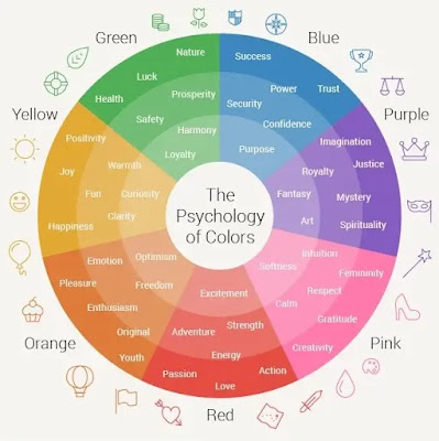
Color Psychology


Before we dive into the specifics of UI design, let's get to know the basics of color psychology. Different colors evoke different emotions and perceptions. Here's a quick overview:

Red: Associated with passion, excitement, and urgency.

Blue: Evokes trust, serenity, and professionalism.

Yellow: Represents happiness, optimism, and attention-grabbing.

Green: Symbolizes growth, nature, and harmony.

Purple: Conveys luxury, creativity, and spirituality.

Orange: Radiates energy, enthusiasm, and playfulness.

The Role of Color in UI Design:

1. Branding:

Colors are integral to a brand's identity. They help users recognize and remember your product. Think of Facebook's signature blue or McDonald's vibrant red and yellow. These colors are not arbitrary; they're carefully chosen to align with their branding and convey specific emotions.

2. User Engagement:

The right color choices can lead to higher user engagement. For call-to-action buttons (CTAs), using contrasting colors that stand out can encourage users to take the desired action, such as signing up, making a purchase, or sharing content.

3. Readability and Accessibility:

Consider your audience's needs. Ensure that your text is easily readable by using high-contrast color combinations. Additionally, adhering to accessibility guidelines (such as WCAG) can make your UI design inclusive and user-friendly for all.

4. Cultural Considerations:

Colors can have different meanings across cultures. For instance, while white symbolizes purity and peace in Western cultures, it's associated with mourning in some Asian cultures. Be mindful of your target audience's cultural background when choosing colors.

5. Emotional Impact:

Understanding the emotional impact of colors is crucial. If your app or website is related to healthcare, soothing colors like blue and green can convey a sense of trust and calm. On the other hand, if you're designing a gaming app, vibrant and energetic colors like red and yellow might be more appropriate.

Case Studies:

Let's explore a couple of case studies to see how the psychology of color influences UI design:

1. Facebook:

Facebook uses a soothing blue color scheme, reflecting trust and dependability. This choice makes users feel safe when sharing personal information and engaging with the platform.

2. Spotify:

Spotify incorporates green and black, symbolizing growth and elegance. This combination conveys that users can expect a sophisticated, music-rich experience.

Practical Tips for Color Selection:

Start with a Mood Board: Collect color samples that resonate with the emotions and personality you want your brand to convey.

Test with Real Users: A/B testing can help determine which color schemes perform best with your target audience.

Use Color Harmonies: Utilize color harmonies like complementary, analogous, or triadic colors to create visually pleasing and balanced designs.

Consider Accessibility: Ensure that your color choices meet accessibility standards for those with visual impairments.

Conclusion:

The psychology of color in UI design is a powerful tool at your disposal. When harnessed effectively, it can shape user perception, drive engagement, and strengthen your brand identity. Remember, color is more than aesthetics; it's a language of emotion. So, next time you embark on a UI design project, think about the emotions you want to convey and choose your colors wisely. Your users will thank you for it.


 10 Essential Principles for Effective UI Design

10 Principles of UI Design

1. User-Centered Design

User-centered design is the foundation of effective UI design. SEO-wise, this principle ensures that your website or app is developed with the user's needs in mind, which can lead to reduced bounce rates and higher organic search rankings.


2. Consistency is Key

A consistent UI design ensures that users can easily navigate your site, improving their experience. Search engines like Google favor websites with low bounce rates, which makes consistency a valuable SEO asset.


3. Simplicity and Clarity

Simplicity and clarity in design are essential for both users and search engines. Clear navigation and a simple layout make it easier for search engine bots to crawl your website.


4. Effective Visual Hierarchy

Creating an effective visual hierarchy guides users through your content. When your website or app has a logical flow, visitors stay longer and engage more, which positively affects SEO.


5. Mobile Responsiveness

A mobile-responsive design is crucial in today's world. Google gives preference to mobile-friendly websites in its search results. Ensuring your UI design is mobile-responsive can significantly impact your SEO ranking.


6. Fast Loading Speed

A fast-loading website or application is more likely to rank higher in search results. Optimizing images, minimizing code, and using browser caching are just a few ways to speed up your UI.


7. Clear Calls to Action (CTAs)

Clear, well-placed CTAs can improve user engagement. From an SEO perspective, they encourage users to explore your site further, reducing bounce rates and potentially improving your ranking.


8. Accessibility for All

An accessible UI design is not only inclusive but also beneficial for SEO. Search engines consider accessibility features as a positive ranking factor.


9. Quality Content Integration

High-quality, relevant content integrated into your UI design can drive organic traffic. SEO optimization of this content can further boost your rankings.


10. Regular Testing and Improvement

Continuous testing and improvement of your UI design help ensure it remains effective. This ongoing process can also help you adapt to changing SEO trends and algorithm updates.


Conclusion

Effective UI design is not only about aesthetics and user experience; it also has a significant impact on your SEO rankings. By following these 10 essential principles for effective UI design, you can create a website or application that not only looks great but also performs well in search engine results. 


Remember that the key to SEO success is a user-centric approach. So, whether you are building a website from scratch or revamping an existing one, keep these principles in mind to achieve a balance between user satisfaction and search engine visibility.

This is Full Series Course here you learn step by step UI/UX Designing.


We will delve into the world of UI/UX designing, covering the latest trends and best practices to help you create compelling digital experiences that keep users engaged.


what is ui/ux design


Chapter 1: Understanding UI/UX Designing


What is UI Design?


UI design, or User Interface design, focuses on the visual elements of a website or application. It includes everything users see and interact with, such as buttons, menus, and layout. In 2023, UI design is all about minimalistic, clean, and intuitive design elements.


What is UX Design?


UX design, or User Experience design, concerns itself with the overall feel of the user's interaction with a product. This includes the ease of navigation, efficiency, and overall satisfaction. In 2023, UX design aims to create seamless, enjoyable user journeys.


Chapter 2: The Importance of UI/UX Design


Boosting Engagement and Conversions


Effective UI/UX design can significantly enhance user engagement, increasing the likelihood of conversions. We'll explore the latest strategies for optimizing user flows and calls to action in this section.


Building Brand Trust and Loyalty


A well-designed UI/UX fosters trust and encourages users to return. We'll discuss how to create consistent brand experiences in 2023 to build long-term customer loyalty.


Chapter 3: UI/UX Design Trends for 2023


Dark Mode and Light Mode


The dark mode and light mode interface trend continue to gain popularity. We'll examine how to implement this feature and its impact on user experience.


Micro-interactions


Micro-interactions are subtle design details that can make a big difference. Learn how to use them to improve user engagement.


Voice User Interfaces (VUI)


Voice assistants and VUI are growing in importance. Discover how to integrate voice interfaces into your designs.


Chapter 4: UI/UX Best Practices


Mobile-First Design


Mobile users are a significant portion of your audience. We'll explore the principles of mobile-first design and its importance in 2023.


Responsive Web Design


In a world of various screen sizes and devices, responsive design is crucial. Find out how to ensure your site or app works flawlessly on all platforms.


Accessibility


Web accessibility is not just a trend; it's a legal requirement. We'll cover the latest accessibility guidelines and how to implement them.


Chapter 5: UI/UX Tools


Figma


Figma is a popular collaborative design tool. Learn how it can streamline your UI/UX design process.


Adobe XD


Explore the capabilities of Adobe XD, a comprehensive UX/UI design tool that can help you create prototypes and interactive designs.


Chapter 6: UI/UX Testing and Feedback


A/B Testing


A/B testing is essential for optimizing your design. We'll discuss the latest A/B testing tools and strategies.


Gathering User Feedback


Understanding user feedback is crucial. Discover methods for collecting and interpreting feedback to refine your designs.


Conclusion


UI/UX design continues to evolve, driven by changing user expectations and technological advancements. Staying updated with the latest trends and best practices is vital for creating engaging digital experiences that captivate your audience. 


Mr.16x9 blog

Contact Form

Name

Email *

Message *

Theme images by Jason Morrow. Powered by Blogger.
Javascript DisablePlease Enable Javascript To See All Widget